Lisvane Art Workshop

Colour & Tone
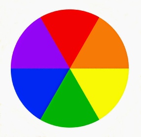
Colour comprises three primary colours -
By mixing the primary colours, secondary colours are produced -
However, because our paints are produced from naturally-
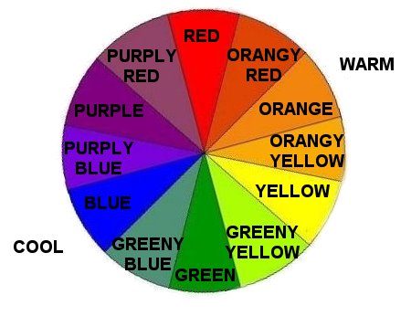
The paint manufacturers sometimes name their paints after the pigments from which they are made, but they may alternatively give them a special name. Some examples of each colour are given here:
purply red -
orangey red -
greeny blue -
purply blue -
greeny yellow -
orangey yellow -
Mixing
In theory, mixing the three primary colours will produce black. However, in practice, no pigment produces a perfect primary colour, so a mixture of the three will just be muddy! You will see from the colour wheel that mixing a primary colour with its opposite secondary will also produce mud, as the mixture will again contain all three primary colours.
Clean, vibrant secondary colours may be obtained by mixing pigments, which together contain only two of the primary colours, without any trace of the third primary. The cleanest colour is obtained by mixing together the two colours closest together on the colour wheel. Again, consult the modified colour wheel above for guidance.
For example, mixing prussian blue (a greeny blue) with lemon yellow (a greeny yellow) will produce a mix containing no trace of red (in this case, the third primary). Conversely, mixing ultramarine (a purply blue) with lemon yellow (a greeny yellow) would introduce some red, the third primary, and the resultant mix would be greyer or muddy.
In addition, some colours are naturally ‘cool’ while others are naturally ‘warm’. Warm mixes are produced from warm colours e.g. to produce a warm green, start with a warm yellow (eg cadmium yellow).
Since greens comprise a lot of yellow and a little blue, it is always advisable to start with yellow and add the blue to it. Similarly, start with yellow when mixing orange, and start with red when making purple.
Let’s have a look at a few examples:
To make a warm green, start with a warm yellow eg cadmium yellow. Add some blue -
Likewise, to make a cool green, start with a cool yellow (eg lemon yellow), and add some blue (whichever works best), maybe some water, until you get the desired colour.
Using just the colours mentioned practice mixing the right and wrong combinations to see what happens.
Earth Colours
In addition to the six colours given above, there are some known as ‘earth’ colours, mainly because they include various degrees of all three primary colours. Consequently, they should be used with care to avoid muddiness. The most notable are raw and burnt umber, raw and burnt sienna, Indian red, and various ochres, but there are many others.
Burnt Sienna -
Raw Sienna -
Burnt Umber -
Raw Umber -
Indian Red -
Yellow Ochre -
Understanding Tone
Most of us will have seen a greyscale like the one on the BBC television test card. It shows a range of tonal values from white to black, usually about 10 values with white being value 1 and black as 10.
We can resolve many more than 10 different tones in the foreground (near to us), but the further away objects are from us, the less tones we are able to define.
There are no pencil lines in nature to separate different objects. We see them by their difference in tonal value, eg in a light coloured house against a dark background or vice versa. The greyscale tonal scale exists also in colours. To best see adjacent coloured objects it will be necessary to have a tonal value difference of at least two values.
For instance, it would be difficult to see, say, a blue of tonal value 4 against a touching green of the same value, but not so if not if one of the values was 2 or 6.
When painting a landscape put the lighter values in the background distance, and all of the values into the nearby objects. A useful observation is that the further away that objects are, the more they take on the sky colour and tone. Hence distant hills and mountains will, on a sunny day with a blue sky, themselves have a blue cast. Keep the warm colours for the foreground and the cooler colours(blues) for the distance. This will give aerial perspective to your painting.
Ian Philpot 9 April 2016
With grateful thanks to Paul Arnott and Arnold Lowrey for assistance in compiling this guide.